Consider a wall over which we have two windows that are placed to far apart or too small. The best way to hide this obvious mistake is to cover it with draperies... and....
Not just that will help solve the problem , the draperies should be of the same value as of the wall.... So now the windows will blend with the wall...! Our prob solved ...! :)
Happy decorating..!! :)
Thursday, February 4, 2010

Monday, February 1, 2010
colors - A million and one!
A thousand and more colors exists and we come across them everyday. We live in world full of pure colors that are of different shades , value , intensity , contrast etc which makes a the difference.
But, we just chose to live around those colors that we find pleasant and that reflects our personality.
Here are few important properties of the color a decorator and a more importantly the client should understand.
Hue : -
What is the first thought you have in your mind when someone asks you what is the color of your car or sofa? would would think of the name of color - my car is red or sofa is brown. Now that name of the color is called Hue.
Value : -
Remember
Color + White ----> (Light value) Tints
Color + Black -----> (Dark value) Shades
Gray scale chart

Color value scale

What not to do ..!
Never ask anything like "what shade of red is your car?"..!
Never say "Its very light shade".!
There is no thing as light shade.
Shade is like the shade of the tree , always darker than the pure hue. :)
Contrasts :-
Contrasts work both the ways - To hide an object or make it the center of attraction..!!
---> Best example to hide an object that you do not want your guests to notice easily is quick tip #2.
You would have not noticed this fireplace if not for the woods..!!

---> Now to bring something to center of attraction is where the value if contrast will help the most.
For Example : -
Lets consider a situation where we have a fireplace mantel which is of white marble and the walls of the room are painted off white. This is where the fire place is hidden and can not be noticed , or its blends with the wall. This is only when you want to hide the fire place for some reason. But to make it the center of attraction , one obvious way is to increase the value of the wall surrounding it.

And to give it a better look we can arrange some accessories over the mantel...!
What not to do...!!
Avoid sharp contrasts (Very light against very dark) unless a dramatic effect is required.
And to balance such contrast , for example we can add a plaid sofa and two throw pillows between the area of soft and dark values.
Best is to avoid such gaudiness...!
Remember - Dark value heavier in weight than the lighter value. So to bring a balance, we can have more smaller areas with dark values to balance the large area of lighter value.

The pictures used here are not my work. Its just google'd give the readers the best example for the contents in my post.
To be continued ......
But, we just chose to live around those colors that we find pleasant and that reflects our personality.
Here are few important properties of the color a decorator and a more importantly the client should understand.
Hue : -
What is the first thought you have in your mind when someone asks you what is the color of your car or sofa? would would think of the name of color - my car is red or sofa is brown. Now that name of the color is called Hue.
Value : -
Remember
- Value is the amount of lightness or darkness in a color.
- Value progress from white (Lightest) to black (Darkest) with shades of gray between them.
- Value is ONLY Lightness or Darkness.
Color + White ----> (Light value) Tints
Color + Black -----> (Dark value) Shades
Gray scale chart

Color value scale

What not to do ..!
Never ask anything like "what shade of red is your car?"..!
Never say "Its very light shade".!
There is no thing as light shade.
Shade is like the shade of the tree , always darker than the pure hue. :)
Contrasts :-
Contrasts work both the ways - To hide an object or make it the center of attraction..!!
---> Best example to hide an object that you do not want your guests to notice easily is quick tip #2.
You would have not noticed this fireplace if not for the woods..!!

---> Now to bring something to center of attraction is where the value if contrast will help the most.
For Example : -
Lets consider a situation where we have a fireplace mantel which is of white marble and the walls of the room are painted off white. This is where the fire place is hidden and can not be noticed , or its blends with the wall. This is only when you want to hide the fire place for some reason. But to make it the center of attraction , one obvious way is to increase the value of the wall surrounding it.

And to give it a better look we can arrange some accessories over the mantel...!
What not to do...!!
Avoid sharp contrasts (Very light against very dark) unless a dramatic effect is required.
And to balance such contrast , for example we can add a plaid sofa and two throw pillows between the area of soft and dark values.
Best is to avoid such gaudiness...!
Remember - Dark value heavier in weight than the lighter value. So to bring a balance, we can have more smaller areas with dark values to balance the large area of lighter value.

The pictures used here are not my work. Its just google'd give the readers the best example for the contents in my post.
To be continued ......
Tuesday, January 26, 2010
Quick tip #1
If you have furniture's of different style or seem unrelated , the best possible way to unite is by using colors. For example
1) In a living room you can use throw pillows that has the same hue as one of the upholstered furniture over the others furniture's.
2) You can use the same material as of the curtains and create a mix of similar hue but different value and shade for the throw pillows and spread it over the furniture's.
This picture gives a clear picture of how the furniture's can be brought closer and united. Here however they are using the same pattern (Circular) of the painting with different value and shade but of the same set warm colors.

The pictures used here are not my work. Just to give the readers the best example for the contents in my post.
1) In a living room you can use throw pillows that has the same hue as one of the upholstered furniture over the others furniture's.
2) You can use the same material as of the curtains and create a mix of similar hue but different value and shade for the throw pillows and spread it over the furniture's.
This picture gives a clear picture of how the furniture's can be brought closer and united. Here however they are using the same pattern (Circular) of the painting with different value and shade but of the same set warm colors.

The pictures used here are not my work. Just to give the readers the best example for the contents in my post.
Monday, January 25, 2010
Experiencing colors
I would like to illustrate the importance of color with a simple photography below and see how it brings life to a picture.

Now adding colors to the picture - A picture is worth a thousand words.

similarly, We have to have bring life to the room we are decorating for our clients.
#1 . Colors are the Single most important factor in creating the mood of a room.
#2. Its knowledgeable use of color can make a room come alive and make it sing.
#3. Not just our eyes , but our mind and emotions respond to different colors in different ways.
Even in our day to day life we use colors for various responses i.e "In the pink" ,"feeling blue" , "a rosy outlook" Etc.
Now here are some colors and the impressions they give :-
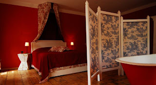
Red - strongest, most stimulating color.
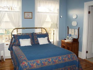
Blue - serene , cool, remote.
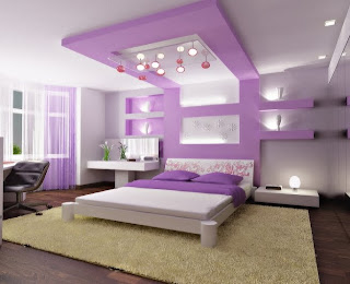
Violet - impressive , stately.
Green - restful , calm.

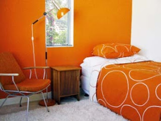
Orange - cheerful , warm.
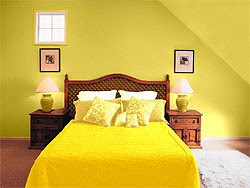
Yellow - sunny , bright.
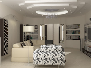
 Neutral - Like the black , white ,gray and toned down brown and beige are sometimes considered no colors. They may sound dull but can be made exciting and sophisticated if handled skilfully.And the best example i have come across so far,
Here we are just discussing pure colors - the bright colors we see in children's paint jars. But these colors can be modified to make it more attractive to more people.
These colors can be made lighter, darker or duller to bring different impact on people. For example , a person who hates pure red might like rich wine red color.
The pictures used here are not my work. Just to give the readers the best example for the contents in my post.

Now adding colors to the picture - A picture is worth a thousand words.

similarly, We have to have bring life to the room we are decorating for our clients.
#1 . Colors are the Single most important factor in creating the mood of a room.
#2. Its knowledgeable use of color can make a room come alive and make it sing.
#3. Not just our eyes , but our mind and emotions respond to different colors in different ways.
Even in our day to day life we use colors for various responses i.e "In the pink" ,"feeling blue" , "a rosy outlook" Etc.
Now here are some colors and the impressions they give :-
Red - strongest, most stimulating color.

Blue - serene , cool, remote.

Violet - impressive , stately.

Green - restful , calm.

Orange - cheerful , warm.

Yellow - sunny , bright.
 Neutral - Like the black , white ,gray and toned down brown and beige are sometimes considered no colors. They may sound dull but can be made exciting and sophisticated if handled skilfully.And the best example i have come across so far,
Here we are just discussing pure colors - the bright colors we see in children's paint jars. But these colors can be modified to make it more attractive to more people.
These colors can be made lighter, darker or duller to bring different impact on people. For example , a person who hates pure red might like rich wine red color.
The pictures used here are not my work. Just to give the readers the best example for the contents in my post.
Monday, December 28, 2009
Well this my first ever post on my first ever blog.And this is meant to, or should help those who need tips and ideas on Interior decoration. For those who are wondering why its named "colors of life", I could say we spend most of our time relaxing at home where we want things to reflect our mood,The colors to speak of us to our visitors etc etc, But actually there is no such reason and I just happened to like the phrase which speaks for itself in a million ways. So, lets get started to explore the colors of life.
Subscribe to:
Posts (Atom)